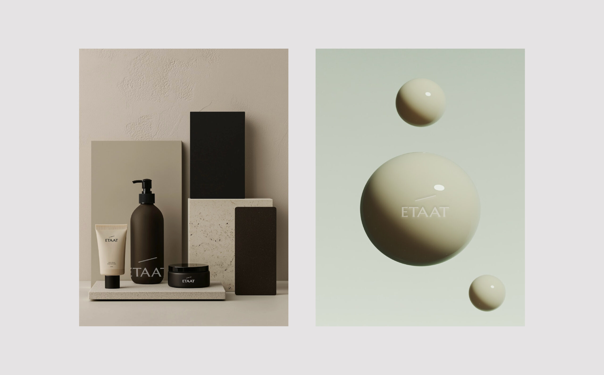
This project redefines haircare with science-backed formulations and a commitment to sustainability. Each bottle is designed for a second life, transforming into a functional everyday item. Rooted in innovation and craftsmanship, it blends timeless design with a lasting impact.
What we design
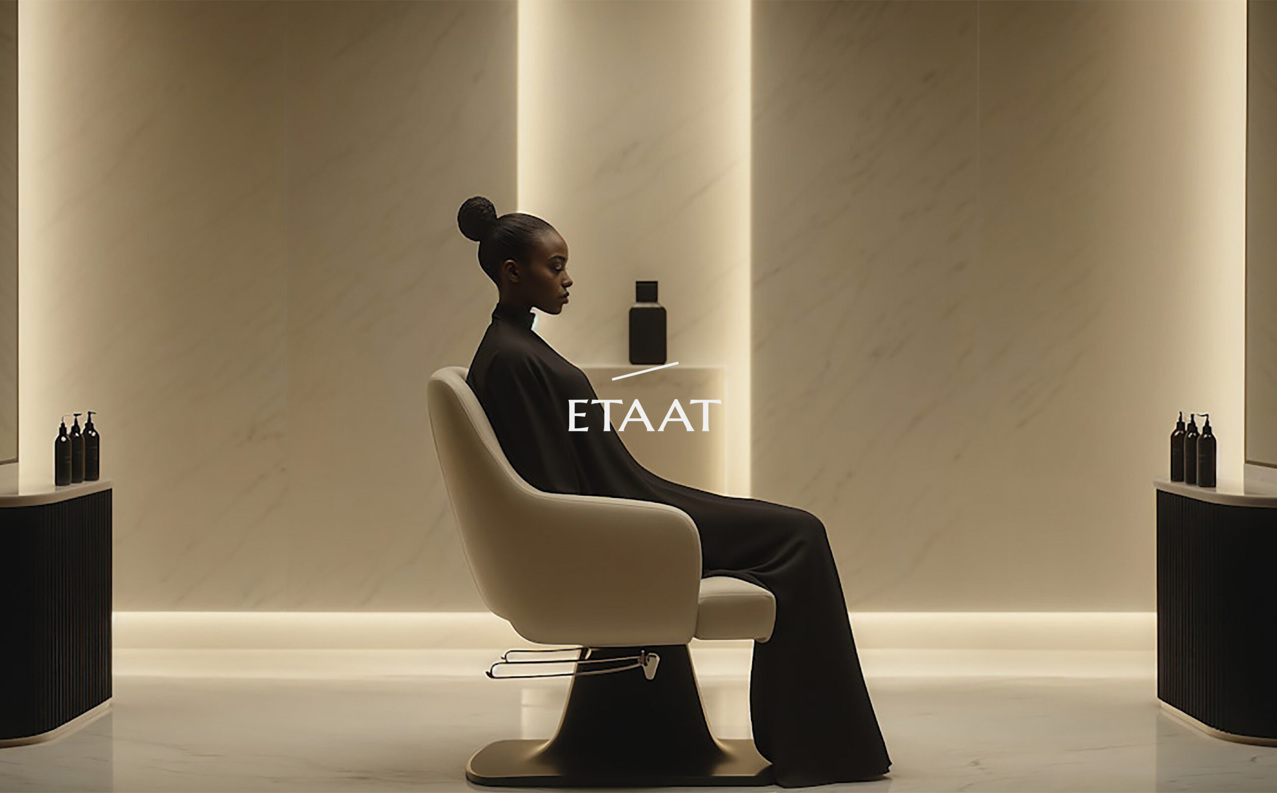
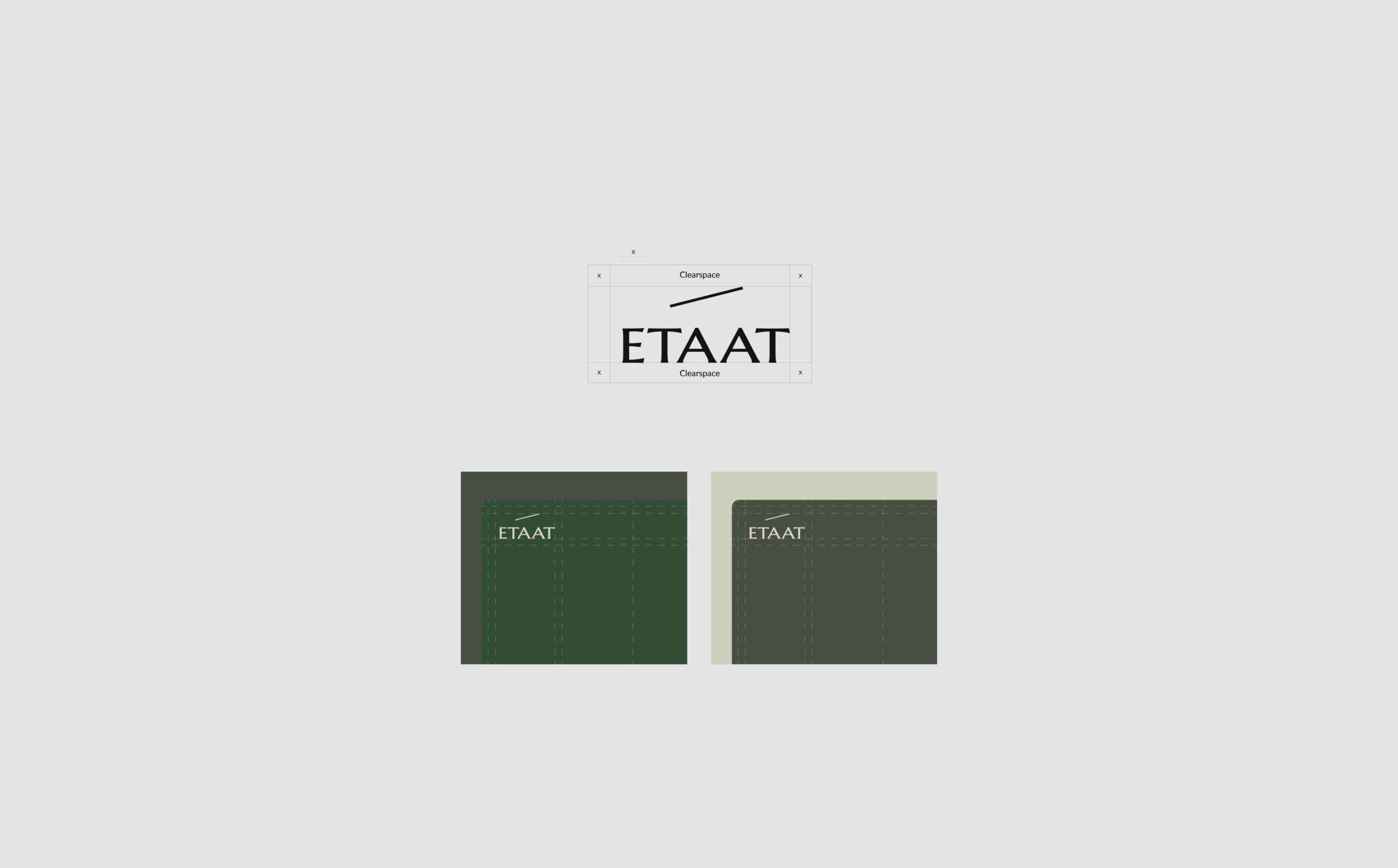
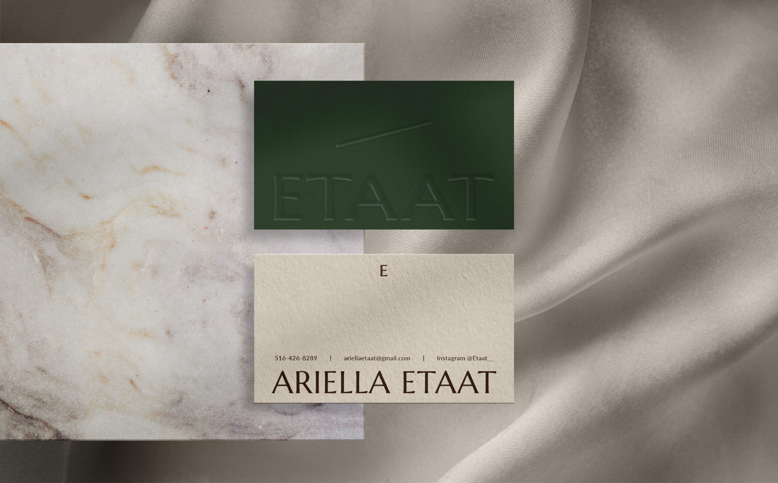
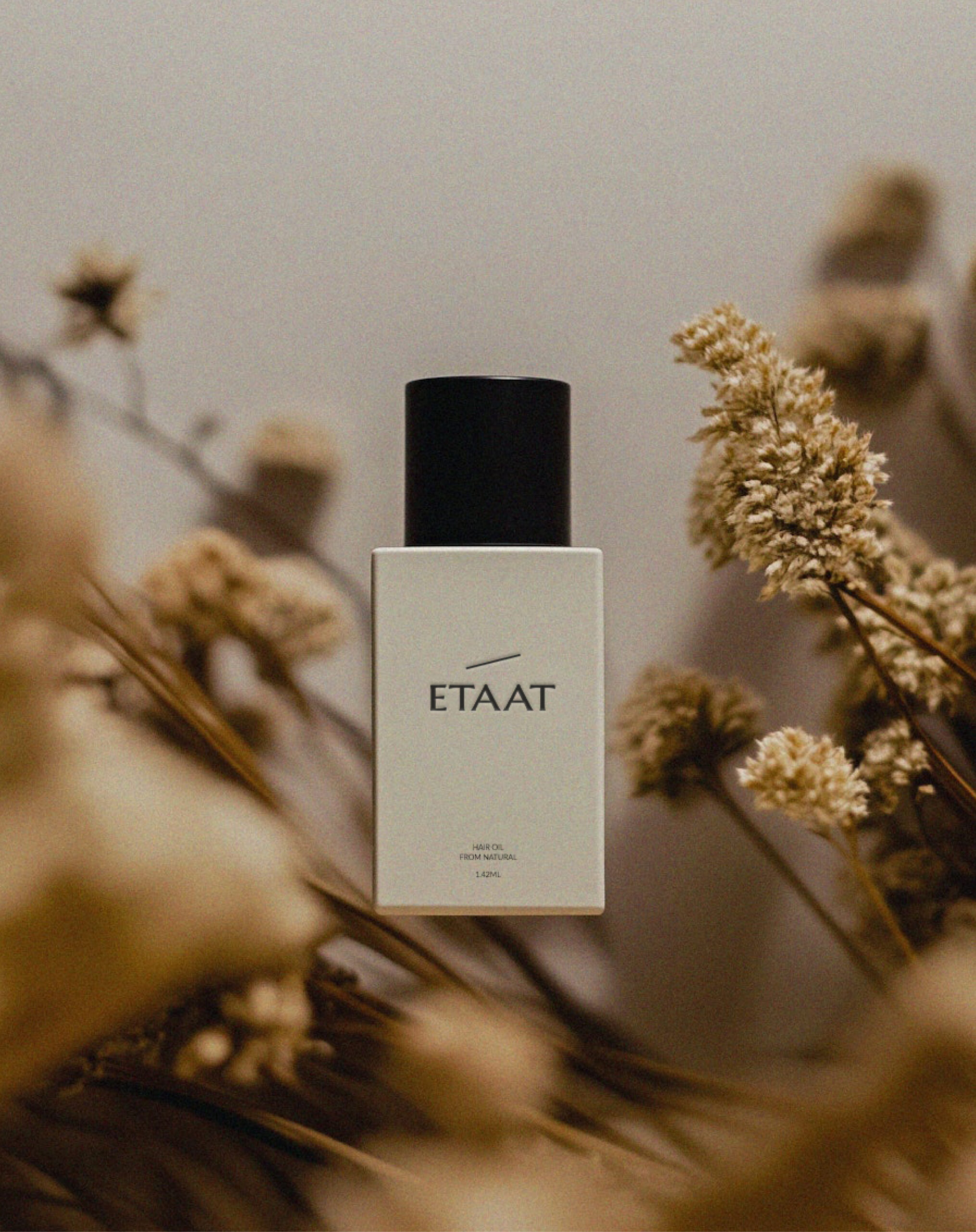
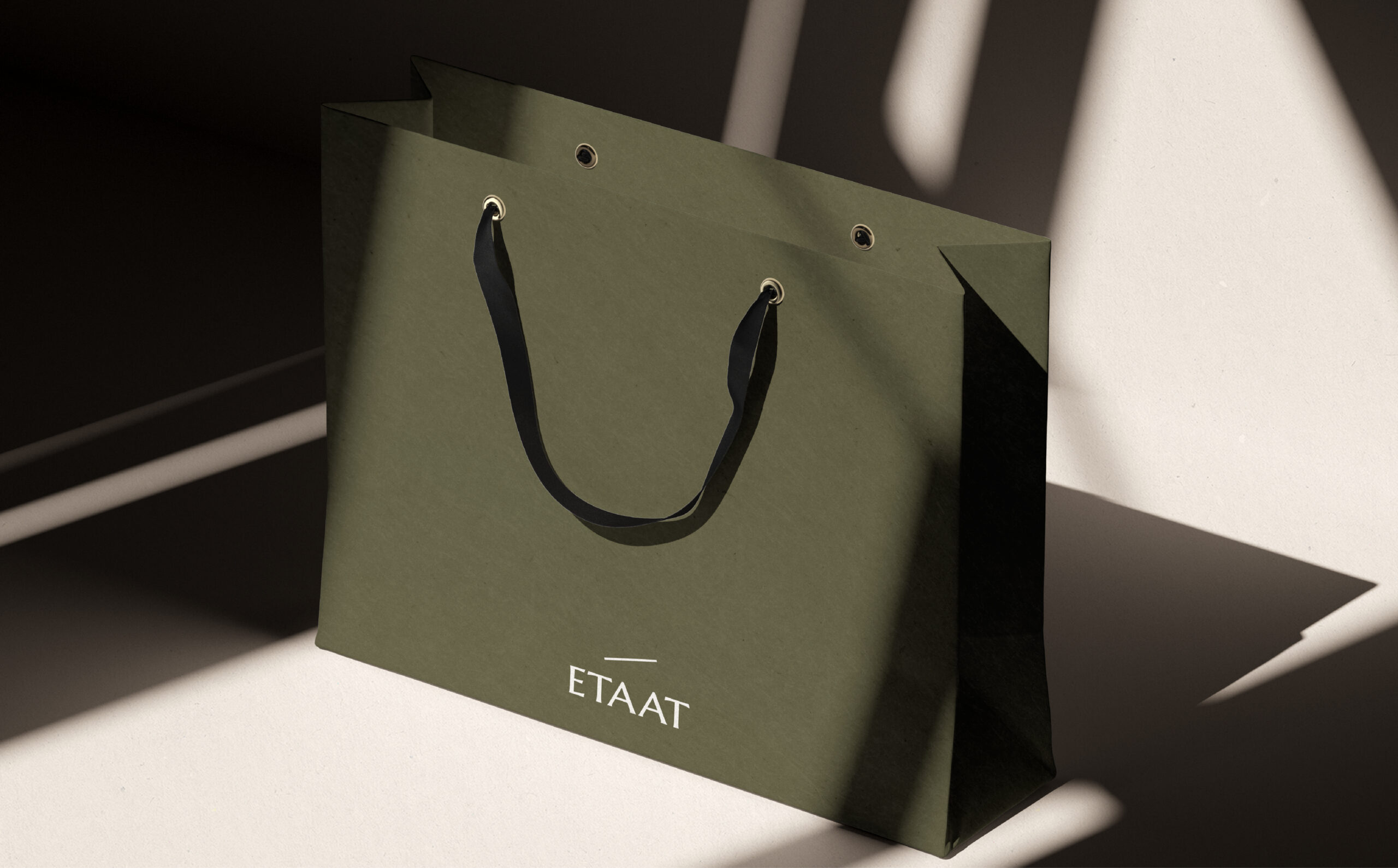
We craft a haircare brand where innovation meets sustainability, seamlessly blending science-backed formulations with thoughtful design. Our visual identity reflects this philosophy, with a slash-inspired logo icon—a nod to the mathematical division symbol, representing the balance between progress and responsibility.
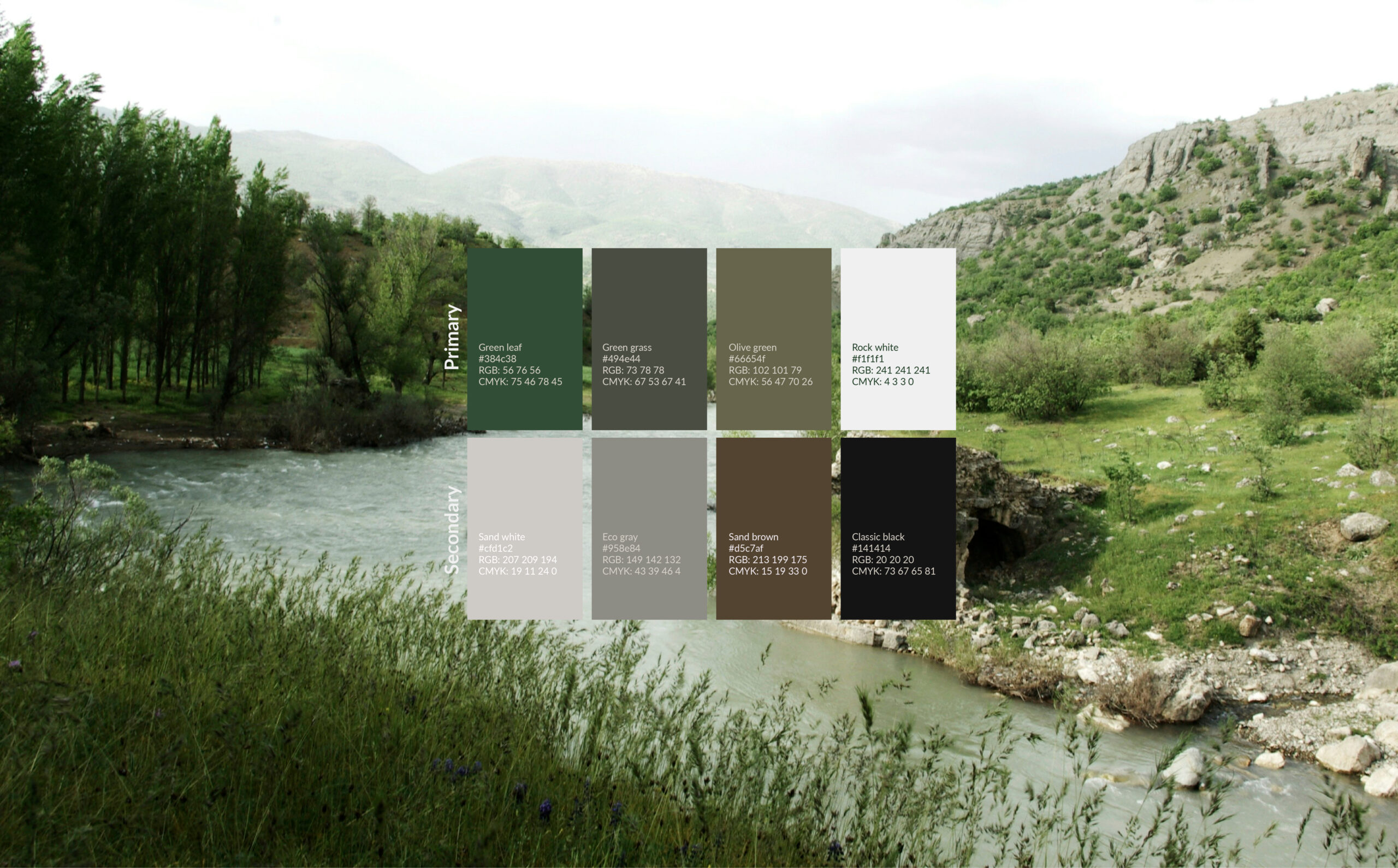
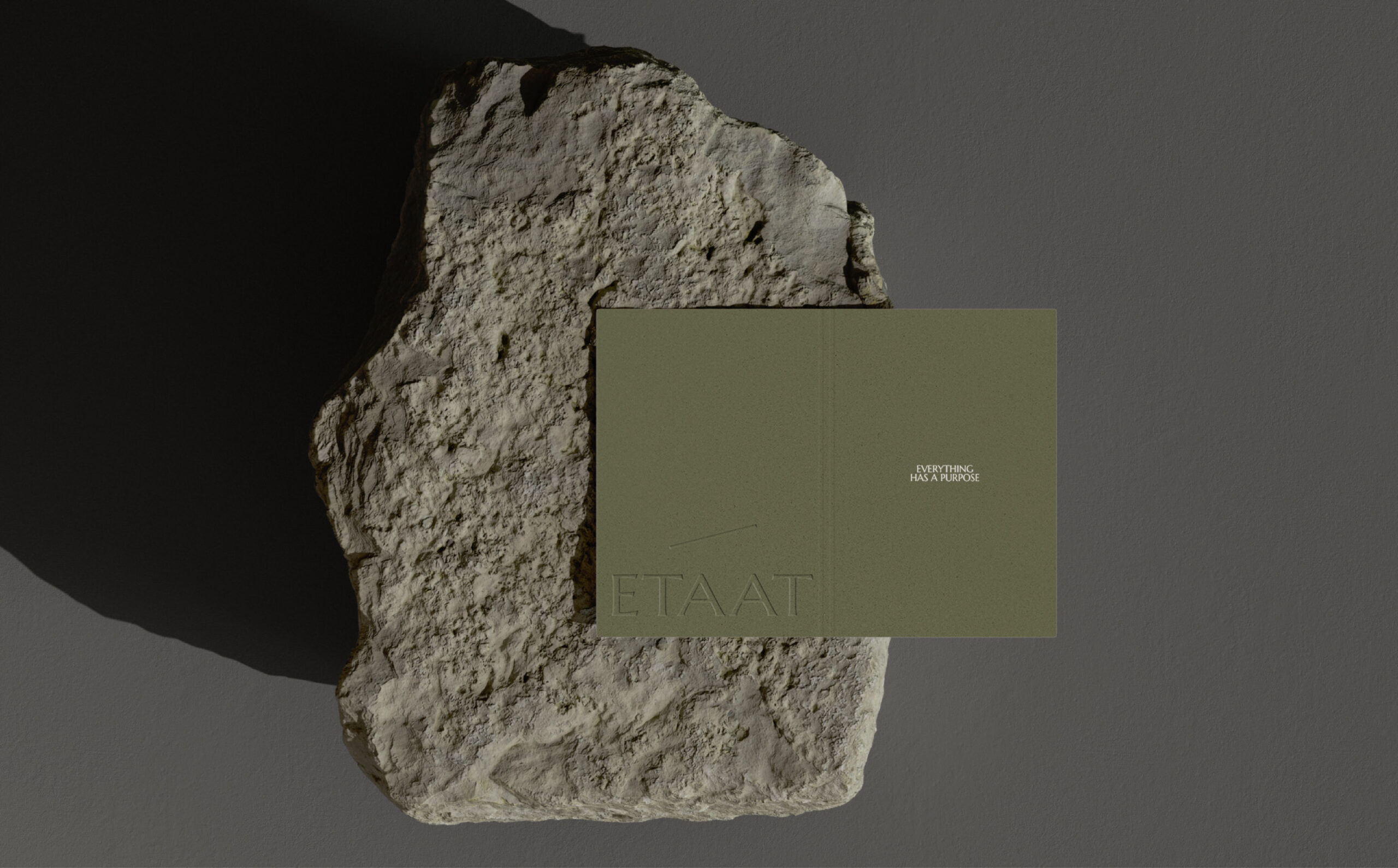
Our color palette is drawn from nature, reinforcing our commitment to sustainability while evoking a sense of harmony and authenticity. To elevate the brand’s presence, we use a serif typeface, adding a touch of sophistication and timeless elegance.
Beyond aesthetics, every element of our design—from packaging to typography—aligns with our mission: to create a brand that is as refined as it is responsible.