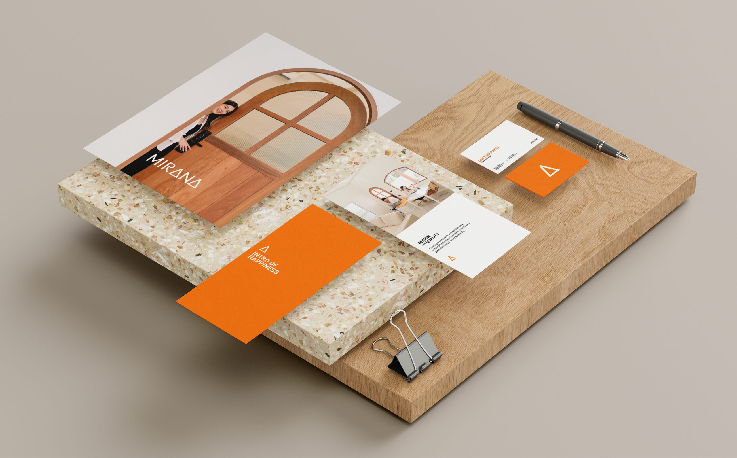
Mirana is more living space that present “Design x Quality x Service x Standard x Location base on philosophy ” Build the best product for our customer ” Their specialty in functional modern real estate goes beyond an adoration for the minimalistic style. With a commitment to principles of efficiency, standardisation and modular ability, Mirana are no more—and no less—than what is necessary.
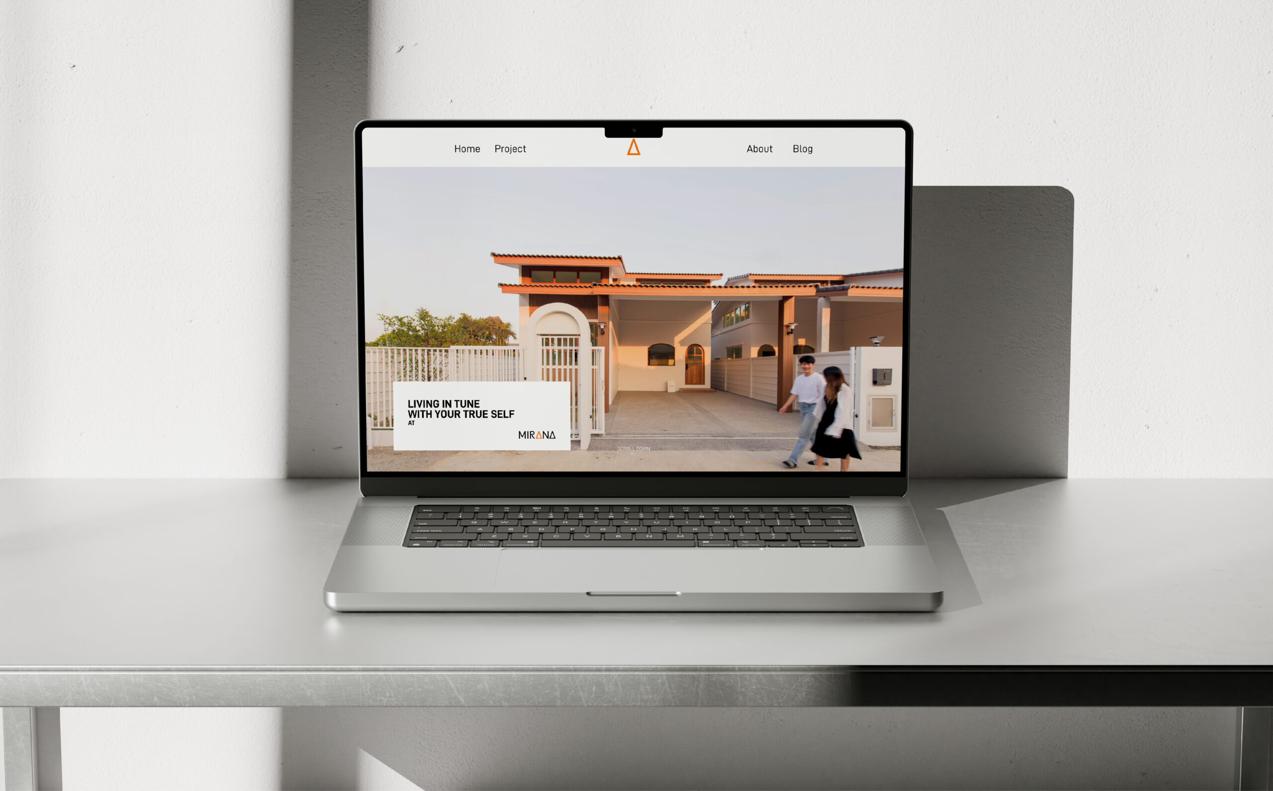
What we design
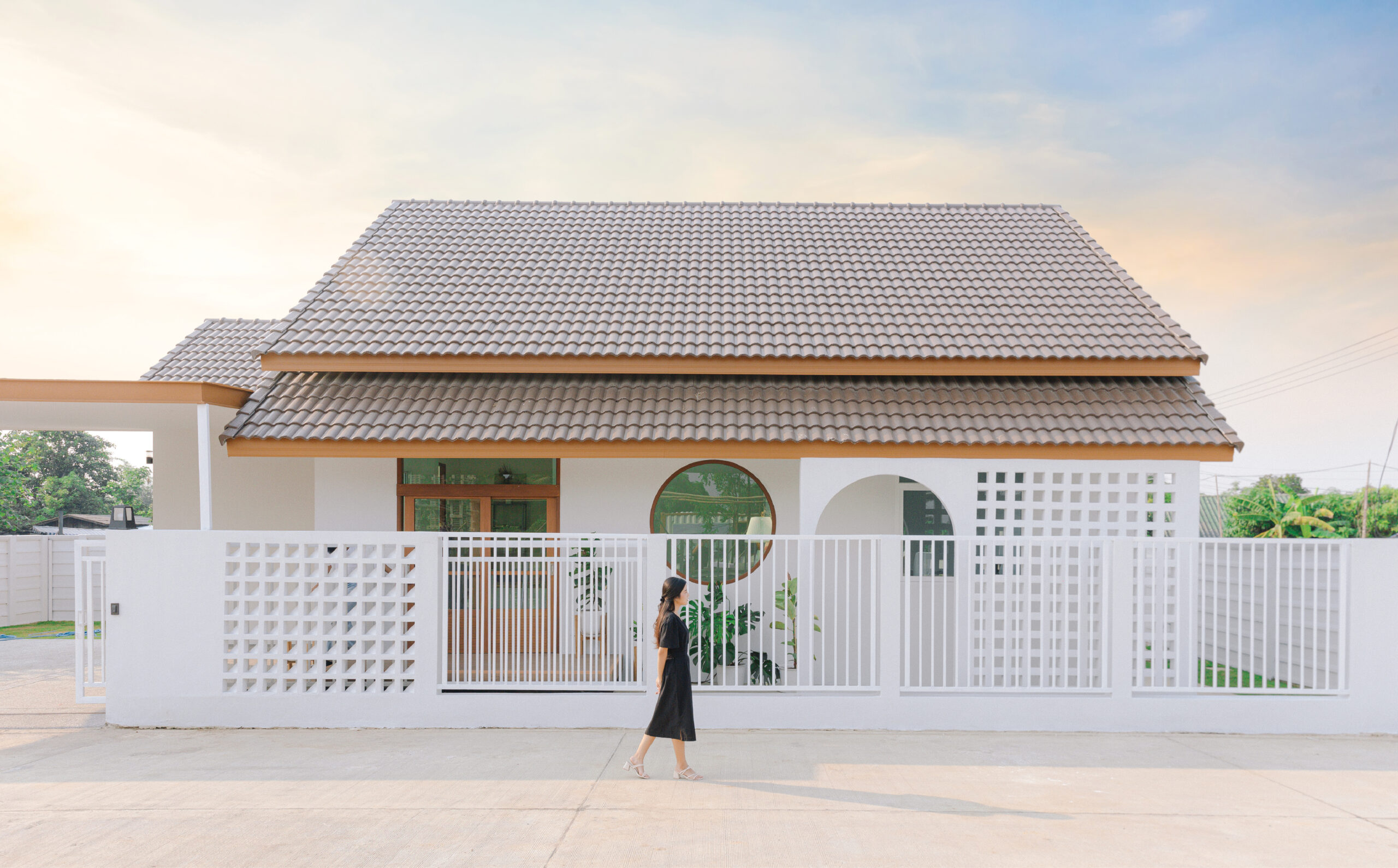
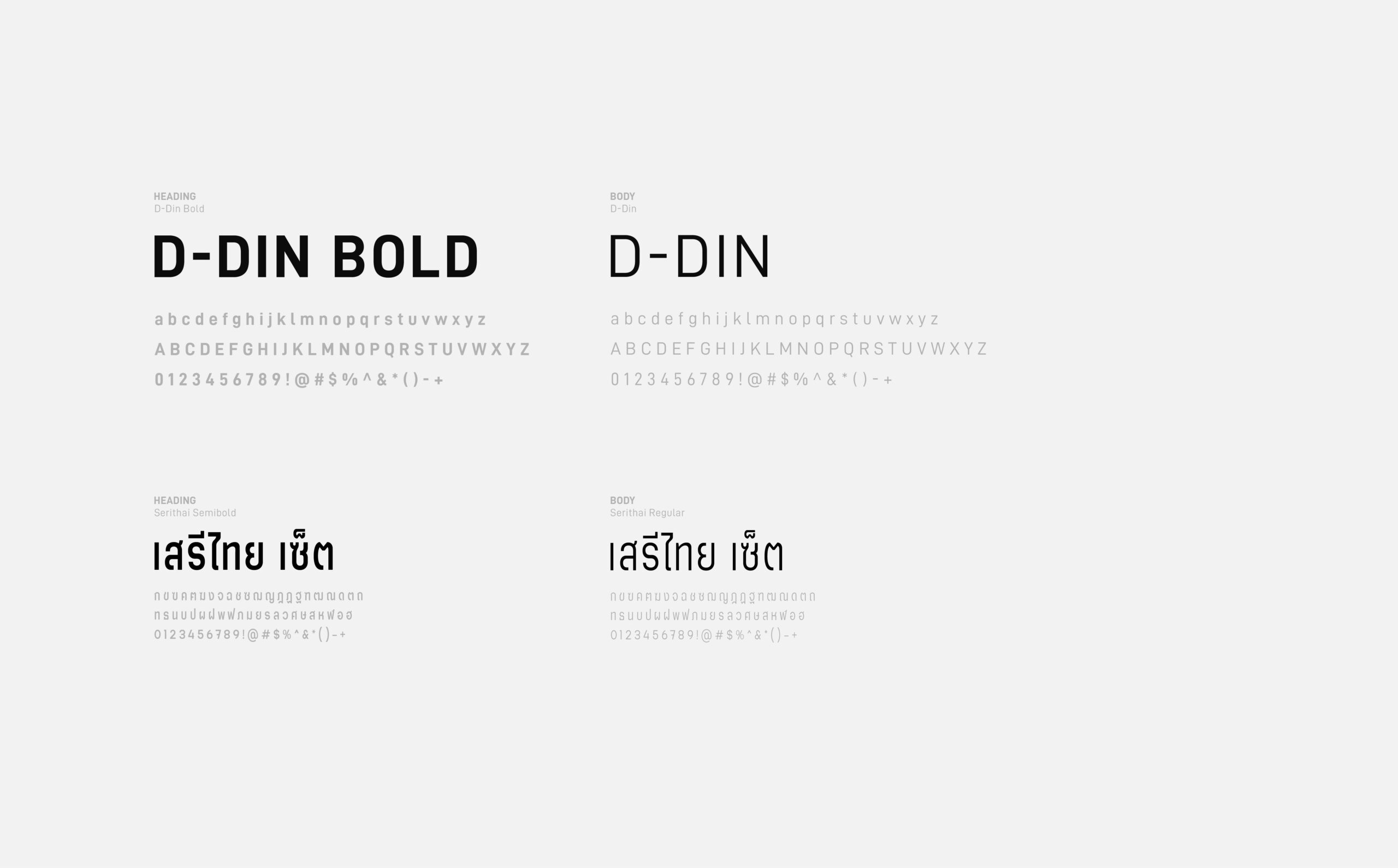
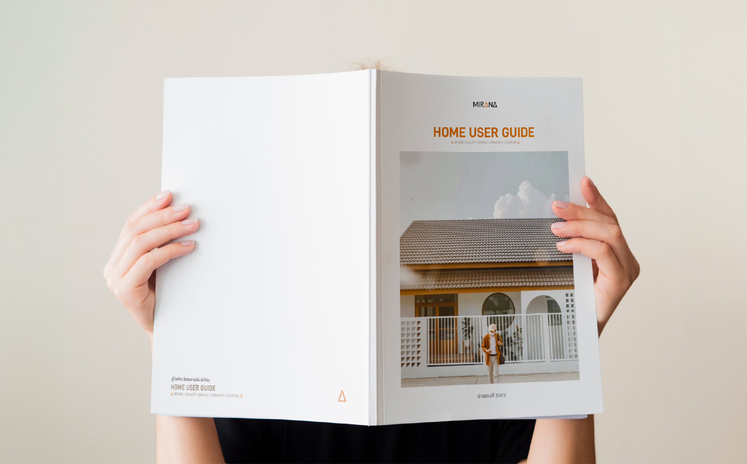
For this project, we aim to present a minimal and timeless design.
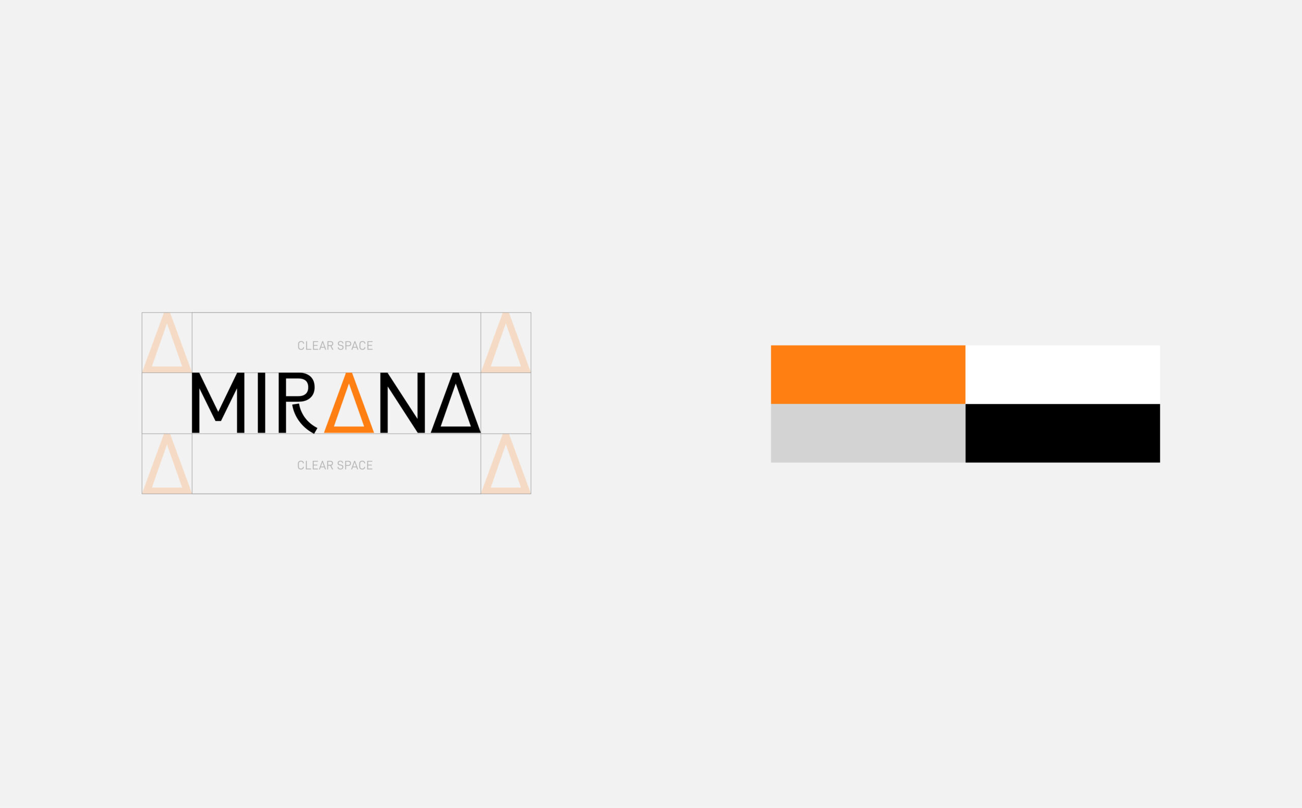
Starting with the logo, we use a logotype featuring a triangle (representing the letter "A" in "Mirana"). This triangle is a key visual identity of the brand, inspired by the shape of a house roof.
Mirana's primary colors are orange, representing a cozy and fresh feeling, and white, symbolizing simplicity.
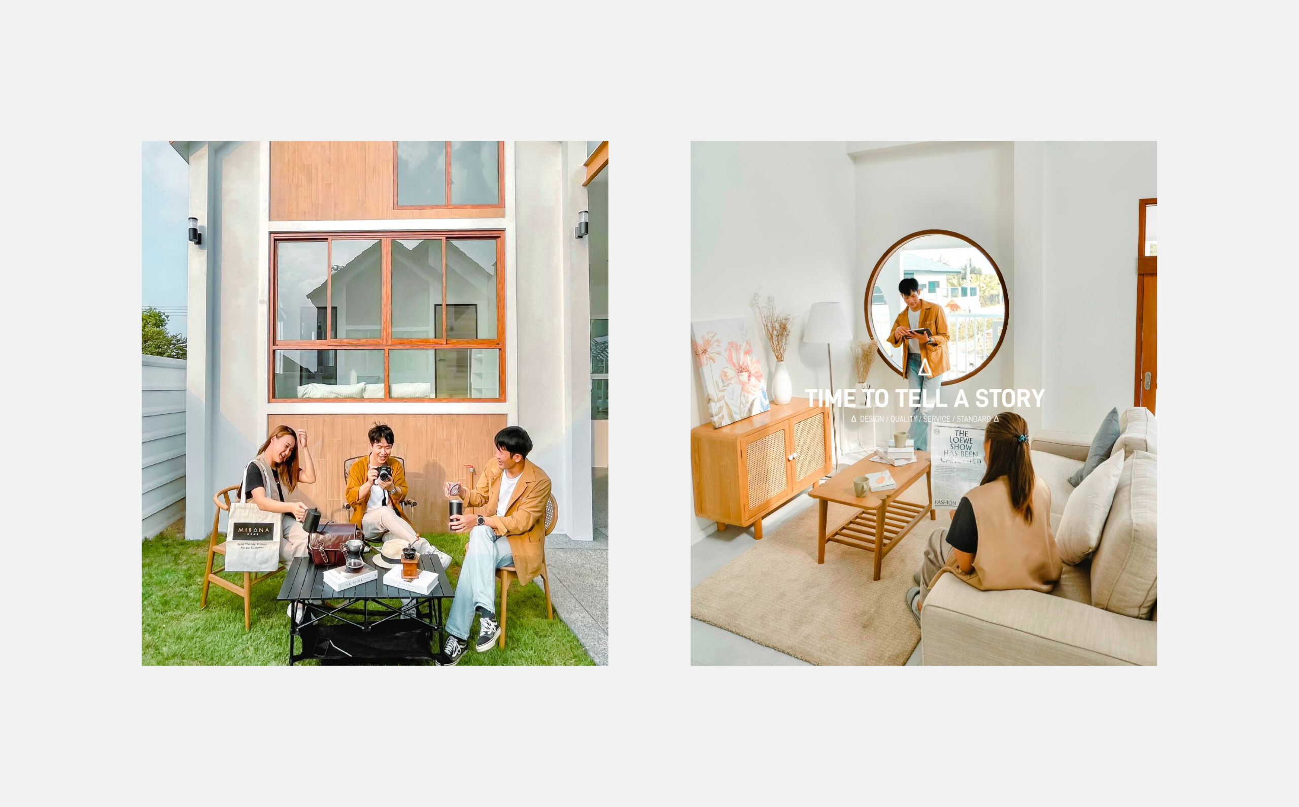
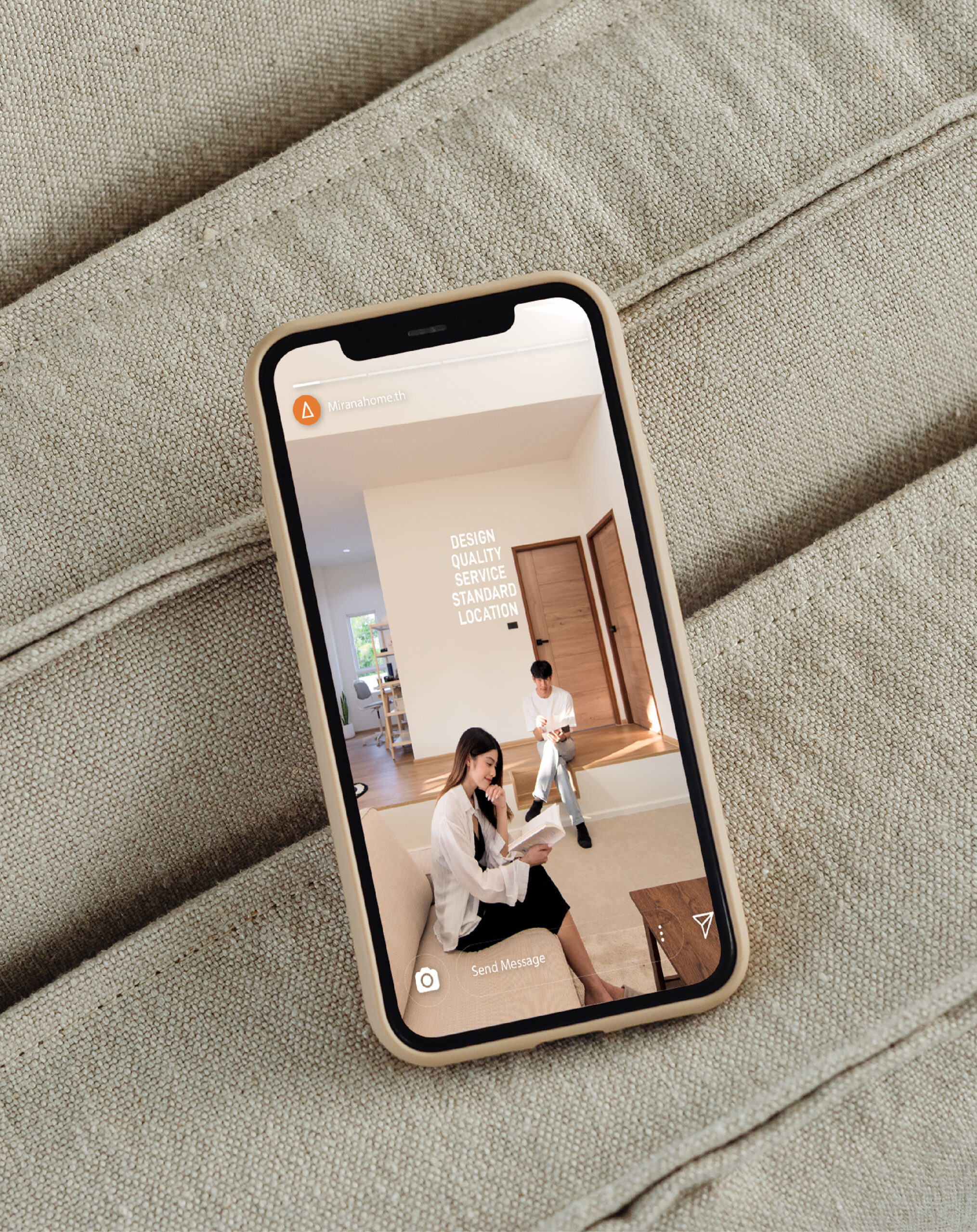
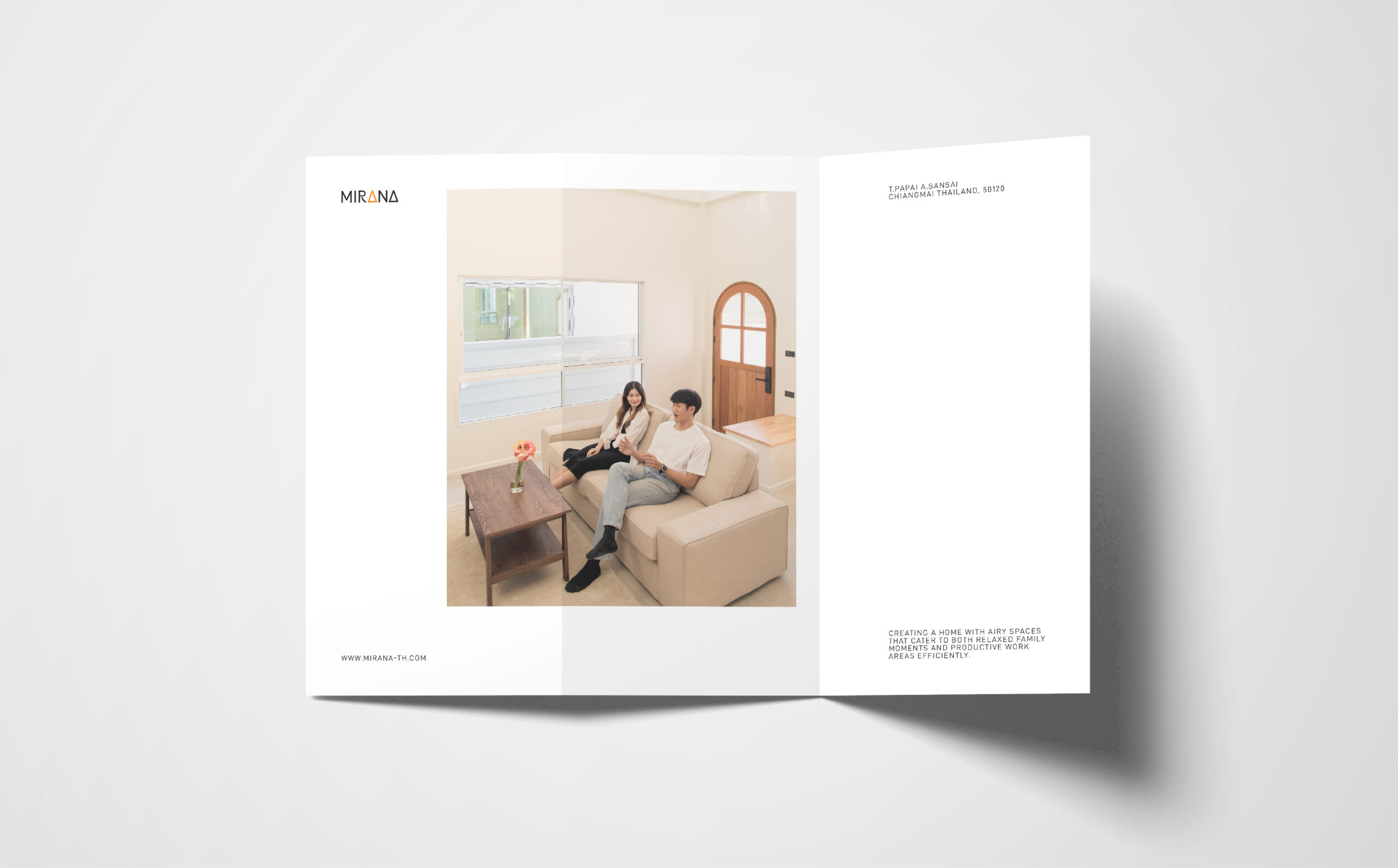
For photography, we focus on bright, open, and airy images to create a warm and welcoming atmosphere.